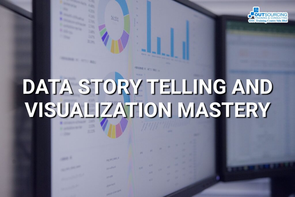
INTRODUCTION FOR DATA STORY TELLING AND VISUALIZATION MASTERY
In today’s data-driven world, raw numbers alone do not drive decisions. The ability to analyze, interpret, and present data effectively is crucial for professionals seeking to influence decisions and drive meaningful change. This course equips participants with the skills to transform data into compelling stories through structured analytics and visualization techniques.
LEARNING OBJECTIVES
By the end of this two-day training program, participants will be able to:
Apply core data analytics methodologies to extract actionable insights.
Structure and communicate data-driven narratives tailored for different audiences.
Use effective data visualization techniques to present complex information clearly.
Design compelling dashboards and reports that support storytelling.
Build confidence in presenting data insights for strategic decision-making.
LEARNING OUTCOMES
Upon successful completion of this training, participants will be able to:
Demonstrate a practical understanding of the data analytics process, from data cleaning to interpretation.
Translate complex data into engaging visual formats that tell a story.
Create and deliver impactful data presentations using dashboards, infographics, and visual storytelling techniques.
Effectively communicate insights and recommendations to both technical and non-technical stakeholders.
Make data-driven decisions that align with business goals and audience needs.
WHO SHOULD ATTEND
This course is designed for a broad range of professionals who work with data or communicate data-driven insights, including:
Senior Management Executives
Business Analysts
Data Analysts
Marketing and Sales Professionals
Researchers and Academics
Project Managers
Policy Makers & NGO Professionals
Anyone interested in improving their data storytelling and visualization capabilities
TRAINING METHODOLOGY
This highly interactive program uses a combination of:
Short lectures to introduce key concepts and frameworks
Hands-on exercises using real datasets to apply new skills
Group work for collaborative learning and peer feedback
Case studies to explore real-world applications of data storytelling
Final presentation for practical application and feedback
COURSE CONTENTS
- Introduction to Data Analytics & Storytelling
- The Role of Data in Decision-Making
- The Data Analytics Process: Collection, Cleaning, Analysis, Interpretation
- Why Storytelling Matters in Analytics
- Key Characteristics of an Effective Data Story
- Activity: Case study discussion – How organizations use data storytelling for impact
- Data Analytics Methodologies
- Types of Data Analytics: Descriptive, Diagnostic, Predictive, Prescriptive
- Defining Business Questions for Analysis
- Data Sources: Structured vs. Unstructured Data
- Methods for Data Cleaning and Preparation
- Activity: Hands-on exercise – Cleaning and preparing sample datasets
- Data Exploration & Finding Insights
- Exploratory Data Analysis (EDA) Techniques
- Identifying Patterns, Trends, and Outliers
- Understanding Correlation vs. Causation
- Using Aggregations, Filters, and Statistical Summaries
- Activity: Group work – Analyzing real-world datasets to extract insights
- Fundamentals of Data Visualization
- Principles of Effective Data Visualization
- Selecting the Right Visualization for the Data Type
- Common Mistakes to Avoid in Visualization
- Enhancing Readability and Interpretability
- Activity: Participants review and critique different data visualizations
- Turning Analysis into a Narrative
- The Storytelling Framework: Context, Conflict, Resolution
- Structuring a Data Narrative with Visuals
- Understanding Your Audience & Tailoring Your Message
- The Role of Emotions in Data Storytelling
- Activity: Participants outline a data story using a provided dataset
- Advanced Visualization Techniques
- Creating Dashboards for Interactive Storytelling
- Using Charts, Maps, and Infographics for Impact
- The Role of Color, Typography, and Layout in Visual Design
- Best Practices for Presenting Quantitative Information
- Activity: Hands-on dashboard creation in Excel, Tableau, or Power BI
- Communicating Insights Effectively
- Storytelling with Numbers: Simplifying Complexity
- The Power of Comparisons and Benchmarks
- Building Credibility with Transparent Data Interpretation
- Presenting Data to Non-Technical Audiences
- Activity: Participants refine and prepare their final data stories
- Final Data Story Presentations
- Participants present their data stories
- Peer and instructor feedback
“Unlock new opportunities by joining our training. Sign up now and invest in your future!“